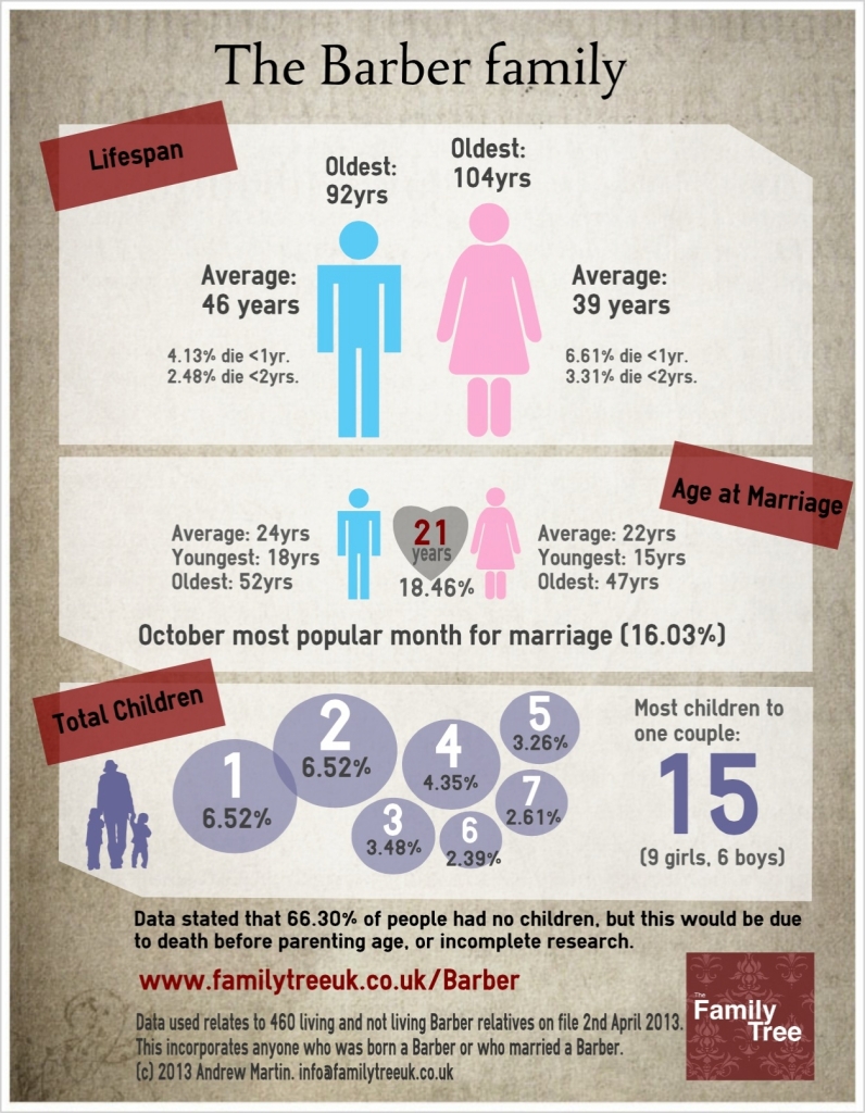
I’d been looking for an excuse to combine my love for infographics (small chunks of information delivered as graphics) with my love for genealogy, and now I’ve achieved it. Here’s my first attempt at combining the two.
Using the data buried in my Reunion10 Mac software (see Reports > Statistics), I’ve managed to pull some key figures from the data I have against my maternal Barber family in a bid to make genealogy that little bit more interesting for those relatives who nod and smile when you start talking about ‘the tree’ and hand them a print out showing names of people they’ve never heard of. Maybe this format will help capture their interest and give them some interesting/quirky facts to remember.

I had quite a bit of fun making this, so will probably create some more in due course.
Click the image if you want to see a larger version.

Great infographic! This is the first I’ve seen by an individual genealogist. Love it!
LikeLike
This is wonderful! What a great idea. Something to get our non-genealogy relatives to see our genealogy without cringing. Great job!
LikeLike
Andrew, this is fabulous! Did you use any special design software?
LikeLike
Pam and Jenny, I used free tools online at http://www.easel.ly – takes a little while to get used to how best to do it, but it’s quite fun to do once you’ve decided on your style and what bits of the data you want to share.
LikeLike
Love the idea!
Data may not be as accessible but longest and shortest marriages could be added. Also of interest to many people are the geographic distribution of a surname and the original meaning. (Barber may be obvious as an occupation, but sometimes the obvious is wrong, eg. coward from cow-herd).
LikeLike
Thanks B.G, glad you liked it.
One of the tricks with infographics (and challenges really) is deciding what to leave out. I have data on things like most common age of death, month of birth etc.. and I could probably have raided the likes of Ancestry for distribution data. Deciding on how best to display it can also be a task too.. so i thought i’d have a go, and put it out there for feedback.
Thanks for stopping by, and for commenting – much appreciated 🙂
LikeLike
Andrew, I would love to know what you used to make this infographic! I LOVE IT! I need to do this so maybe my family will show at least a LITTLE interest in what I’m working so hard on 🙂
LikeLike